PROFORMA

Founded by Financial Analysts, Proforma introduces the world to the wonders of capital raises. Already used within SaaS technology markets, Proforma was ready for a brand and UI that matched their ambitions.

Services Provided

Brand Strategy | SaaS Design | Web Design | Data Visualization


BRANDING

BANNER.png

BRand Strategy & Guidelines

Setting a course for the future, Proforma needed a brand that distinguished them as a true pioneer of financial investment.

The Proforma team initially identified their brand attributes as progressive, optimistic, and best-in-class. Although accurate to their current organization, we worked with their team to identify personifiable characteristics of its bolder future, and ones that could only be attributed to Profoma.

We saw Proforma as The Intellectual Maverick: personal and individual. They're Assured and Bright: confident leaders approaching the future with expectancy, not hesitation.

We worked as partners with the Pro-forma team to create a new logo and logotype around a larger brand experience that better communicates to a broader target audience, conveying the values behind the company.

The new brand embodies the attributes of quality, authenticity, credibility, and approachability.

Proforma Logo Mark Design
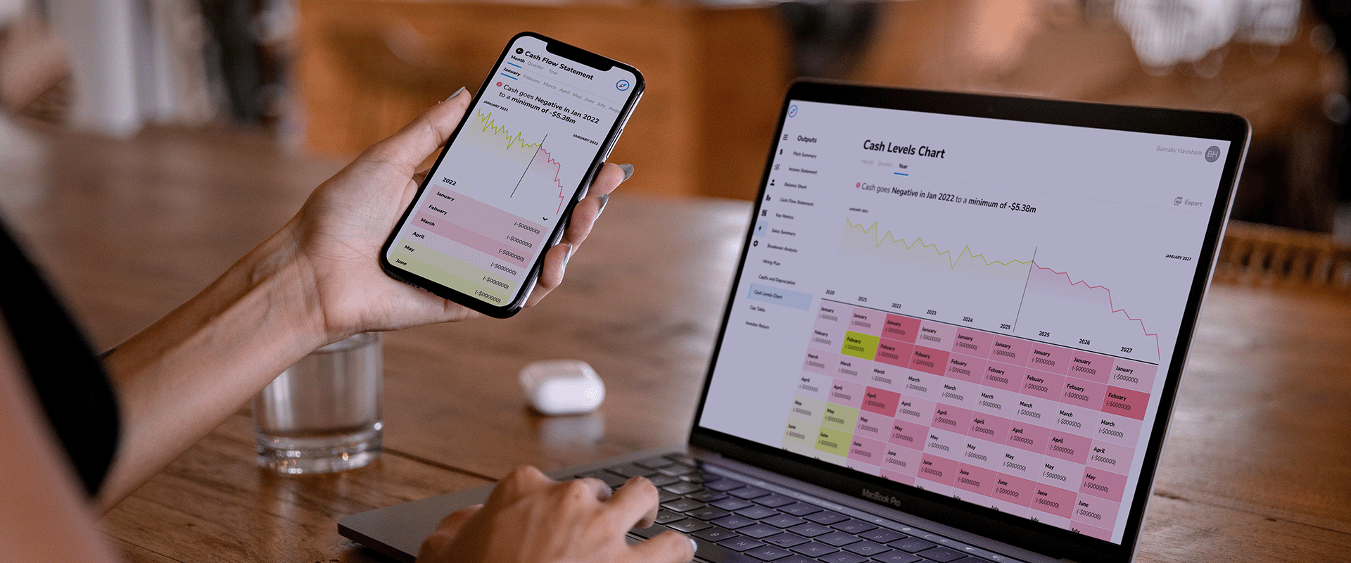
Proforma Mobile App Design
Proforma Mobile and Desktop SaaS design


LOGO

From its position of authority, the brand communicates strength in unity, authenticity, and transformative action.

Proforma's new mark pilots a direction of opportunity. Proforma brings to life the brand's mission-critical opportunity for capital investment. In a world where every company is a software company, Proforma leads the way.

The logotype began as a font, which was then edited to function more as a unique logotype. The logo lockup positions the mark to the right of the logotype, directing the eye forward.

Proforma Fintech Logo Design
Proforma Business Card Design
 

From its position of authority, the brand communicates strength in unity, authenticity, and transformative action.

Proforma's new mark pilots a direction of opportunity. Proforma brings to life the brand's mission-critical opportunity for capital investment. In a world where every company is a software company, Proforma leads the way.

The logotype began as a font, which was then edited to function more as a unique logotype. The logo lockup positions the mark to the right of the logotype, directing the eye forward.


Visual Language

Proforma is blazing the trail and we wanted to use the visual language to reintroduce boldness and dynamism to the brand. Accent colors are bold and UI elements are sharp. A subtle gradient adds color to headlines without being too jarring. Vector and line textures float on the background and create branded, visual balance. A layered blur effect balances strong visual elements with legibility while simultaneously adding depth to compositions.

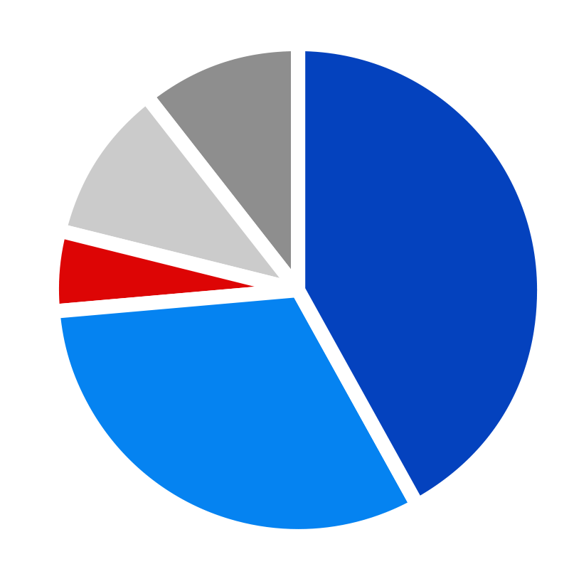
Proforma Brand Colors

INTERACTIVE

User Experience | User Interface Design | SaaS Design | Web Design

BANNER.png

USER EXPERIENCE & USER Interface Design


Case study of User Interface and User experience of Proforma


Our interactive work began with a content audit and low-fidelity wireframes — affectionately called "LoFis." LoFis allow us to work through page goals, content, storytelling, and the customer's journey before UI design begins. For Proforma, we rearchitected some site content to reflect updates to the product and proposed new mental models for understanding its features and offerings. High-fidelity wireframes, or HiFis, then begin to solve the problem of how to communicate that information visually. Through UI design, we brought the brand to life and worked to position Proforma as setting the bar for the future of modern development, including employing stylized visuals and expert visual hierarchy.


User Experience flow of Proforma SaaS App

Throughout the identity and interactive experience, the idea of dynamic movement conveys speed to mimic the environment and experience of feature management.
— Woody

DATA
VISUALIZATION

By utilizing data visualizations, we helped convey both the research and refinement that is integral to the Proforma experience and the complex systems happening seamlessly behind the scenes. Pops of the secondary color palette help elements grab attention and guide the user through the established hierarchy.


Like what you See?

Let’s talk more and see how we can help.

BANNER.png