District Bagels
District Bagels is an upstart in the New York Bagel world. Founded in the Financial District in New York City, Bagels features hand-rolled bagels, savory salads, sumptuous spreads, and sweet pastries.
District Bagels
District Bagels is an upstart in the New York Bagel world. Founded in the Financial District in New York City, Bagels features hand-rolled bagels, savory salads, sumptuous spreads, and sweet pastries.
Along with the client, it was our goal to give them an identity that could extend into multiple locations. Our team started by researching the competition, and by understanding the target audience, we created a modern and fresh brand identity for District Bagels.
We used modern and matte colors, including a warm shade of gold, to give the brand a lively and sophisticated feel. We also designed a unique logo, menu, and collateral that featured hand-illustrated bagels.
We also created various marketing materials to showcase the brand identity, including business cards, packaging, and social media graphics. We also designed a website that was easy to navigate and highlighted the shop's menu and offerings.


The new brand identity for District Bagels was well-received by both the client and their customers. The shop saw increased foot traffic and sales, and the brand has become a recognizable and beloved fixture in the community.
For the logo design of District Bagels, our team wanted to create a unique and playful design that was easily recognizable. We started by sketching out various design concepts, and after several iterations, we settled on a design that featured a bagel with the name of the shop in a fun and playful font.
To create a memorable and eye-catching logo, we used a warm shade of blue for the bagel and a contrasting gold for the text. The font we chose was modern and playful, which helped convey the shop's friendly and approachable vibe.


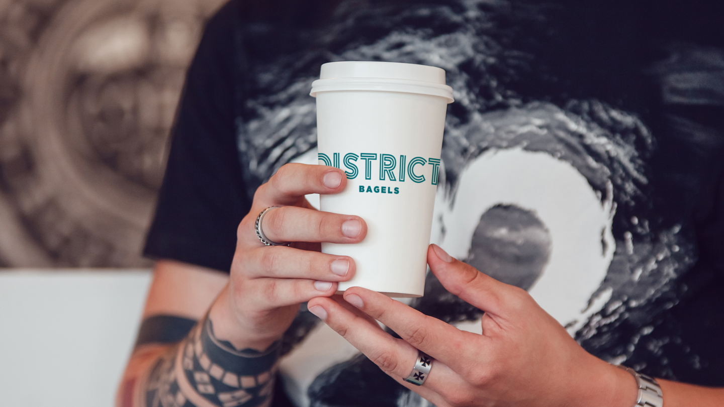
For the packaging design of District Bagels' coffee and bagels, we wanted to create a design that was visually appealing and highlighted the quality of the products. We used a simple, clean layout that was consistent with the rest of the brand identity. To make the packaging stand out, we used a combination of light colors and minimal design for coffee packaging. To ensure that the packaging was functional and easy to use, we included clear labels that listed the ingredients and nutritional information for each product. We also made sure that the bags were easy to open and resealable, to keep the products fresh for longer. The new packaging design for District Bagels' coffee and bagels was well-received by both the client and their customers. It helped to create a cohesive and memorable brand identity that extended to every aspect of the shop's offerings, from the menu to the food truck to the packaging.


For the menu design of District Bagels, our team wanted to create a design that was easy to read and highlighted the shop's offerings. We used a simple, clean layout that was visually appealing and easy to navigate.
To make the menu stand out, we used the same warm blue from the logo design as structure throughout the menu. We also used a minimal layout, which helped to showcase the quality of the shop's offerings.
For the food truck design of District Bagels, we wanted to create an eye-catching yet minimal design. We used the same logo and color scheme from the brand identity to ensure consistency across all marketing materials.
Let’s talk more and see how we can help.